FACT: STAMP primer
STAMP Primer: Hong Kong post stamps
1. Bird Stamps (Definitive issue, 2006)


Context
Shows HK's eco-diversity: "Hong Kong is graced by more than 460 bird species despite its usual image as a city of crowded skyscrapers. This number amounts to one-third of that found in the whole of China and one-twentieth of the global total, which is truly amazing for an area of a mere 1,000 square kilometres."
HK also has a rich diversity of natural habitats such as wetlands and shores that forms the great East Asia bird migratory flyway (which further enrichs its avifauna).
Show variety and equality in a spectrum of bird breeds.
Analysis
Each bird has a full portrait in the center showing each of their unique colours and form. Different background colours (with a faint white silhouette) are chosen to accentuate the birds: for example, the jade background for the $2 Little Egret stamp hints the coastal/ water environment it lives in. The stamps show the majesty of the birds in their most natural posture and form (the curve of the little egret's neck is therefore the focus on the stamp)The birds are realistically portrayed by watercolour/ paint, and accompanied with the elegant serifed font creates a classical design. The prices are all at the bottom of the stamps and are of a darker hue, unless its value is over $10 (one pound), which then the number is white and bolded.
2. Qipao (special stamp issue, 2017)

https://stamps.hongkongpost.hk/eng/newsletter/2017/09/20170913d.htm
 Mint Stamps |
Context
Qipao, a traditional Chinese dress for women that first came into vogue in the 1920s, accentuates the gracefulness of the feminine physique with its oriental charm. These stamps review the evolution of the Qipao from 1920s to the contemporary.
The illustrations on the stamps are the works of students studying for the Higher Diploma in Visual Arts and Culture at the Hong Kong Design Institute. The stamp sheetlets are embedded with the first-ever qipao-shaped stamps. Furthermore, the $20 stamp sheetlet is printed with paper made of taffeta fabric to enhance the theme.
Analysis
The shape of Qipao is well referenced and used in these stamps, especially used as the shape of the stamp, and between the mint stamps to show a transition in time. I like how a close up of the Qipaos are shown on the side of the stamps, which ornaments the plain background and further accentuates the gentle, unobtrusiveness of the body form. Each stamp has its own colour theme of the decade (all pastel-ish, warm harmonizing colours) as the shoes, hairstyles and dress patterns are in conjunction of the Qipao design. I do not know for certain why the prices on the mint stamps are crossed out. The cursive Qipao typography on the larger stamp sheet is a bit too much for me, but otherwise the stamps used a very classical and elegant approach in showing the evolution of the Chinese Qipao culture.
3. Cantonese Opera Repertory (special stamp issue, 2018)

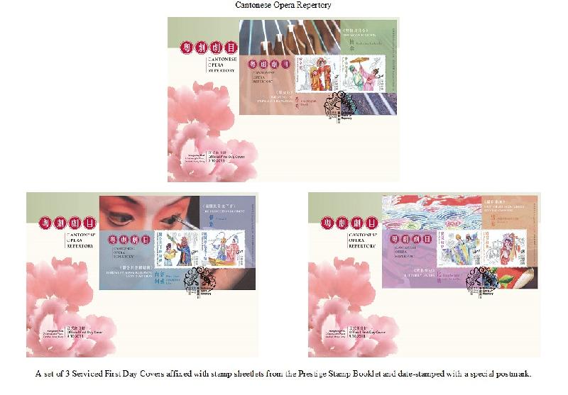
Context
Cantonese opera is a representative traditional performing art form in Hong Kong that was officially inscribed onto UNESCO's Representative List of Intangible Cultural Heritage of Humanity in 2009. It has become an important icon of our local culture - one which is worth savouring and passing on. In Cantonese opera the performers present various stories with the "four basic skills" of singing, acting, narrating and martial arts, complemented by distinctive music, costumes, props and stage settings.
The set of special stamps featuring six immensely popular Cantonese opera plays and their classic scenes, giving vivid and distinctive portrayals of the characters.
Most of the plots are based on folk tales, Chinese history and myths. As the scripts of the plays are often created by talented writers, the lyrics are regarded as literary classics.
Analysis
It is interesting for me to find a comparison of similarly themed special edition stamps released in 2014:

The 2014 stamp(s) focus more on the attire of the Cantonese opera performers/characters and their appearances/personalities. The latest, more recent ones focus more on well-known scenes and the opera plays. I would find the latter one more interesting because part of a narrative/ story is shown, which evokes emotion and interests viewers to look into the stories-- and perhaps watch an opera play. Cantonese opera plays are definitely not as popular in younger audiences and these stamps might be one of the ways to promote and raise awareness for Cantonese operas.
The character in the 2014 stamp is illustrated with more rigid, digitally coloured lines, while the 2018 version seems more handmade and naturally textured (some by colour pencils and pen lines). We could see interactions between characters, which makes them less of a posed doll but more of performers in movement. I think this makes the images more natural and engaging. The vibrantly-coloured characters work well with the black and white outlines in the background as it gives the vibe of Chinese black ink scenic paintings.
4. "Hong Kong-Zhuhai-Macao Bridge" special stamps (2018)

Context
The newly-built Hong Kong-Zhuhai-Macao Bridge (HZMB) links the Hong Kong Special Administrative Region in the east and both Guangdong Province (Zhuhai) and the Macao Special Administrative Region in the west. The stamps mark this important milestone as the Greater Bay Area is now served by an enhanced transport network.
The design incorporates Chinese and English typographic characters, interwoven with a grid-like pattern in the background to form an intricate network. They symbolise the closely and seamlessly knitted highway network that promotes the integration of the cities.
Analysis
I find the design very futuristic but graphic and harsh, very unlike the other examples which are more illustrative. The potential reason would be to showcase the modernity and technical advancement of the bridge construction. It appears to be quite avant garde but the geometric and grid patterns are the exact "inhumane" elements which evokes a certain sense of unease, especially literally connecting the alphabets with "bridges". The colours are mature but darkish and dull, and the illustrated graphics of each city seem slightly oddly placed and non-interactive with with the typography clustering in one corner.

In comparison with the "joint souvenir pack" released in the same theme, I find the imagery in these commemorative stamps brighter and depicting a future more promising, perhaps because the visualization of the bridge (and its landscape) is shown with certainty not ambiguity, despite a literal depiction of the construction project.
5. Monkey King stamp (1974, unknown)

Context
This stamp is issued when HK is still a British Colony, thus the silhouette of the Queen's side face on the top of the stamp. This stamp seems to be a special edition issued for an Arts Festival in 1974.
Analysis
This is a simply composed but effective stamp as an eye-catching image in placed in the center. The illustration has a strong visual effect as it shows the monkey king character, supposedly portrayed in the medium of Cantonese Opera, looking straight at the viewer. The black, white and red/ orange hues create a strong contrast. The print gives a nice effect and the overall bold design matches with the frame of the stamp.
Criticisms and HK postal stamp designs
- Mr. Cheung criticized that recent stamp designs are eccentric and lack creativity, as some designs are rip-offs from special stamp issues in the past-- such as a same-looking pair of stamps issued respectively in 1988 and 2001 featuring the same image of a tree.

http://news.jour.hkbu.edu.hk/tc/2018/01/31/%E7%B4%80%E5%BF%B5%E9%83%B5%E7%A5%A8%E9%81%AD%E8%B3%A4%E8%B3%A3-%E9%87%8D%E7%94%A8%E8%A8%AD%E8%A8%88%E8%A2%AB%E6%89%B9%E6%AC%A0%E5%BF%83%E6%80%9D/
- Graphic designer Mr. Chan thinks the design of HK postal stamps could improve on composition and space. Good designs should be well visible and its theme should be easy to identify despite the small canvas on the stamps. Over placing different elements in the same image would blur the stamps' themes and meanings.
- HK Post office philatelic department promotion team Senior Manager Mr. Lee responded that most stamps are designed locally and often show the culture of Hong Kong effectively enough, but HK Post insists on adding both Chinese and English texts on stamps to present their themes. HK Post also promote philately especially towards schools and for stamps to be used for educational purposes.
Archive: the first public stamp design competition in HK, 1958
http://www.cpa-hk.net/chin1/HK%20'STUDY/hk%20stamps%20first%20design/hk%20stamps%20first%20design.htm
Comments
Post a Comment